
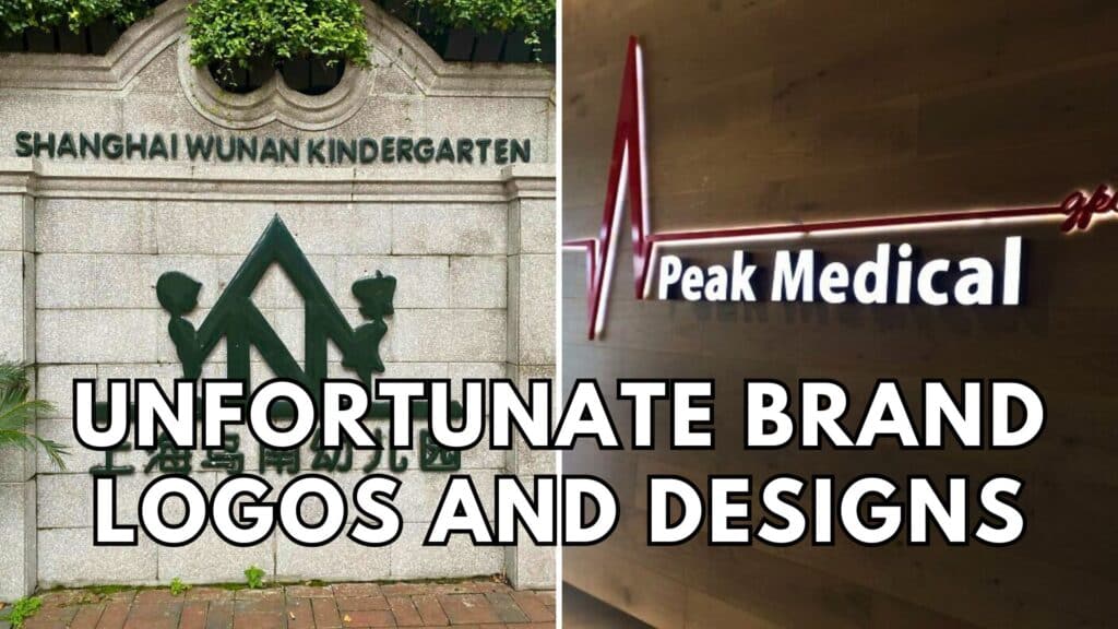
Behind every great brand logo is a team of dedicated creatives who know how to design an eye-catching image. Many of us take design and marketing for granted, but it’s much harder than it seems. For every brilliant brand redesign or logo, dozens of logos don’t make the cut. Don’t believe us? You might agree with us after taking a scroll through these unfortunate brand logos and designs. From unintentional innuendos to terrifying new mascots, these bad logos are the stuff of nightmares.
#1: Kudawara Pharmacy
This “before and after” logo comparison is very unfortunate. Thankfully, the logo on the right is the “after” redesign. But that’s not why we’re here. We are all here to laugh at the old Kudawara Pharmacy logo. It might take you a minute to realize what’s so bad about the old logo. Take your time. We’re sure it will hit you in the face pretty soon.

You’re not alone if your eye was immediately drawn to the “K” in the old logo. The stylized letter looks like two stick figures in a compromising position. The original logo designers shouldn’t have put those two white dots on top. Other than the awkward innuendo, the old logo was just that– old. The new logo looks very sleek and modern in comparison.