
#13: “Nothing Compares”
The Iowa State Fair really missed the mark with this logo design. Or maybe this wildly inappropriate design was right on target with their viral marketing campaign. Who’s to say? Whatever the thought process behind this logo, there’s no denying that it looks extremely suggestive. Sure, it’s just a silo and two giant bales of hay. But it’s also so much more.
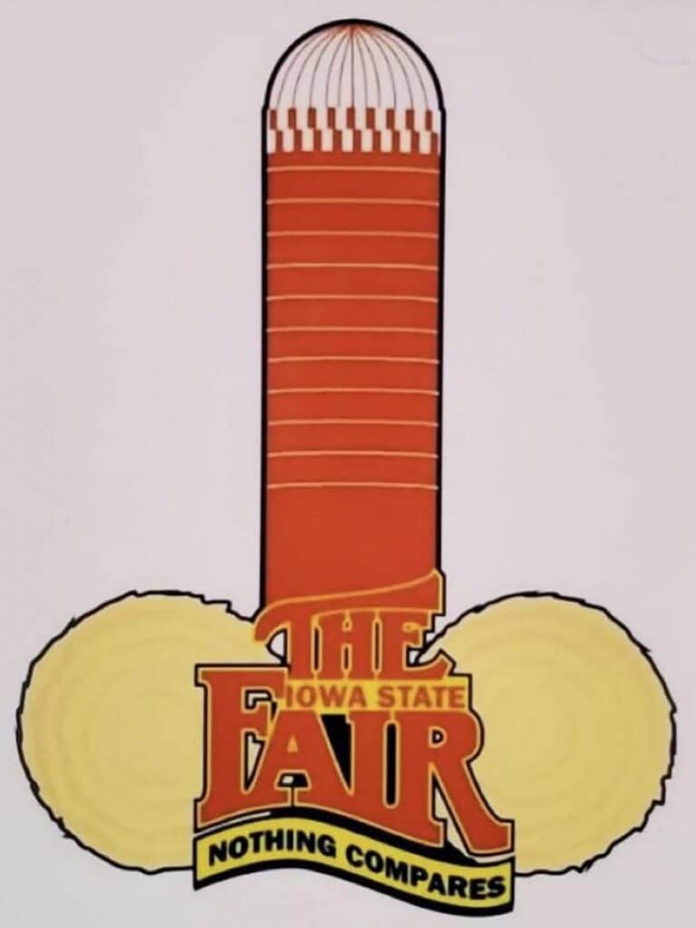
The Iowa State Fair’s slogan is “Nothing Compares.” Nothing truly does compare to this masterpiece of a disaster. The team who approved this design either had no idea what they were doing, or they had a twisted sense of humor. We’re sure some people attended the fair simply because their logo was too hilarious that year.