
#2: A “Safe Place”
National Safe Place is a non-profit organization that provides outreach and prevention programs for minors who need “immediate help and safety.” This organization does a lot of invaluable work for the community, which is why their old logo was so unfortunate. The old logo, pictured on the left, looks quite threatening.
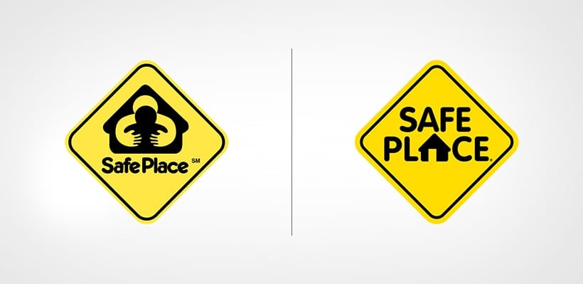
The old logo shows two figures in an embrace. We’re sure it was meant to look like one person giving a protective hug to another, but it looks like a threatening pose instead. Thankfully, this invaluable non-profit hired a new design team and rebranded. We like the new logo much better because it’s easy to read and understand. What do you think?